1064The Future of Logo Design for Businesses
The future of logo design is here. It’s already changed the way we think about building brands. In this article, we’ll discuss how new technology has altered the way designers create logos and how businesses can benefit from their work.
Logos are the face of company brands, reflecting the personality of the organization behind them.
Logos are the face of company brands. They reflect the personality of the organization behind them.
It’s no longer enough to have a logo that looks nice and communicates what a company does. Logos need to be able to communicate much more: from personality traits to mission statements and even goals for future growth.
Over time, trends in logo design came and went, but now it seems there is a more lasting shift in the style of logos as brands seek to be seen as more human, approachable and honest.
A logo is the face of a company brand. When you think about it, every time you see a business logo, it’s because they want to connect with customers and establish themselves as an authority in their industry. Logos are used to convey messages about what companies do and how their products or services can help people solve problems.
Logo design has come a long way since the earliest days of print advertising when the main goal was simply to get attention from consumers. Over time, trends in logo design came and went, but now it seems there is a more lasting shift in the style of logos as brands seek to be seen as more human, approachable and honest — qualities that were lacking at times during previous decades when logos became overly complex or overly simplistic due to technology limitations like screen resolution or printing restrictions (think Comic Sans).
Here are some of the main changes we’ve seen in logo design in recent years.
You might not have realized it, but logo design is evolving. Here are some of the main changes we’ve seen in recent years:
- Logos are more minimalistic. This means they have fewer elements and rely on one or two bold shapes to convey their message.
- Logos are more abstract. This means they’re less literal interpretations of an organization’s name and often draw inspiration from symbolism associated with that company or product line instead.
- Logos are more flat (or “flattened”). The flattened style allows for simpler shapes used within a single-color background, resulting in a minimalist look that’s easier to reproduce across different mediums without losing clarity or definition—and it’s also easier for viewers to process quickly when they see it!
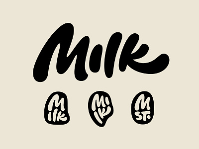
Hand-drawn logos for a personal touch
Hand-drawn logos are a trend that designers have been experimenting with. They’re more personal, authentic, and fun than their digital counterparts. Hand-drawn logos are also flexible and affordable.
Conclusion
So, what do you think? Are we seeing the end of simple, bold logos and more creative designs? Do you want to learn more about the future of logo design? Let us know in the comments below!